Example: Implementing Style Change in Barikoi GL Maps
Introduction
This guide demonstrates how to implement and manage multiple map styles using the Barikoi GL package. You'll learn how to define custom styles, initialize the map with those styles, and create a toggle to switch between them.
Step 1: Define Map Styles
Create an array of styles to be used in your map. Each style contains the style URL, a preview image, and a name.
const styles = [
  {
    style: `https://map.barikoi.com/styles/osm-bright/style.json?key=${Barikoi_API_key}`,
    image: "https://docs.barikoi.com/img/barikoi-light.png",
    name: "Light Style",
  },
  {
    style: `https://map.barikoi.com/styles/barkoi_green/style.json?key=${Barikoi_API_key}`,
    image: "https://docs.barikoi.com/img/barikoi-green.png",
    name: "Green Style",
  },
  {
    style: `https://map.barikoi.com/styles/barikoi-dark-mode/style.json?key=${Barikoi_API_key}`,
    image: "https://docs.barikoi.com/img/barikoi-planet.png",
    name: "Dark Style",
  },
];
Explanation:
- style: The URL for the style's JSON file, which contains the map's appearance settings.
- image: A thumbnail image to preview the style.
- name: A user-friendly name for the style.
Step 2: Initialize the Map
Use the useEffect hook to initialize the map. Ensure the map is created only once.
useEffect(() => {
if (map.current) return; // Prevent re-initialization
map.current = new Map({
container: mapContainer.current,
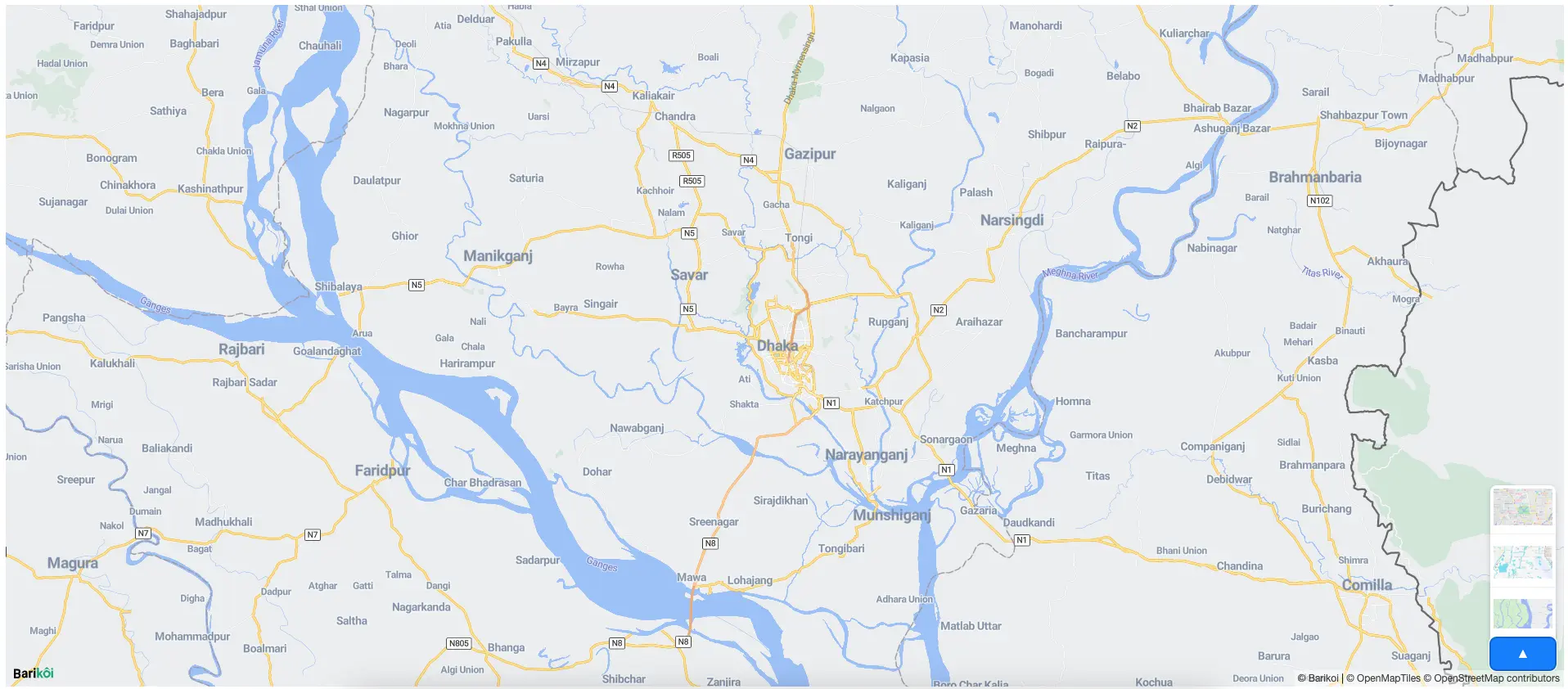
center: [90.39017821904588, 23.719800220780733],
zoom: 10,
doubleClickZoom: false,
styles: styles, // This is where you are passing your desired styles
accessToken: Barikoi_API_key,
});
}, []);
Step 3: Add CSS for Style Drawer
Add custom CSS for the drawer that will allow users to toggle between different map styles. The drawer will display the available styles and their preview images.
/* External CSS for customizing the drawer and toggle button */

/* Style for the drawer container */
.style-drawer {
  position: absolute;
  bottom: 50px;
  right: 10px;
  width: 80px;
  background-color: #fff;
  /* border: 1px solid #ccc; */
  border-radius: 8px;
  box-shadow: 0 2px 6px rgba(0, 0, 0, 0.2);
  overflow: hidden;
  transition: max-height 0.3s ease;
  max-height: 0; /* Initially collapsed */
  z-index: 999;
}

/* Style for the toggle button */
.style-drawer-toggle-button {
  position: absolute;
  right: 10px;
  bottom: 20px;
  padding: 8px 12px;
  height: 40px;
  width: 80px;
  background-color: #007bff;
  color: #fff;
  font-size: 14px;
  border: none;
  border-radius: 8px;
  cursor: pointer;
  box-shadow: 0 2px 6px rgba(0, 0, 0, 0.2);
  z-index: 1000;
}

/* Style for each style item in the drawer */
.style-item {
  display: flex;
  align-items: center;
  padding: 4px;
  cursor: pointer;
  border-bottom: 1px solid #eee;
}

/* Style for the thumbnail image */
.style-item-thumbnail {
  width: 70px;
  height: 30px;
}

/* Style for the style name */
.style-item-name {
  font-size: 14px;
  color: #333;
}
Notes:
- This CSS controls the appearance of the style selection drawer and toggle button.
- The drawer will be initially collapsed, expanding when the user clicks the toggle button.
Full Working Example
Here's the complete example of how to integrate these steps into a React component. This includes the map initialization and the style drawer.
- React Js/Next JS
- CSS
//@ts-nocheck
"use client";
import { useEffect, useRef, useState } from "react";
import { Map } from "bkoi-gl"; // Import the Barikoi GL package
import "bkoi-gl/dist/style/bkoi-gl.css"; // Import CSS for proper map styling

const MainMap = () => {
  // Refs for the map container and map instance
  const mapContainer = useRef(null);
  const map = useRef(null);
  const [drawerOpen, setDrawerOpen] = useState(false);
  const Barikoi_API_key = "YOUR_BARIKOI_API_KEY";
  const styles = [
    {
      style: `https://map.barikoi.com/styles/osm_barikoi_v1/style.json?key=${Barikoi_API_key}`,
      image: "https://docs.barikoi.com/img/barikoi-light.svg",
      name: "Light Style",
    },
    {
      style: `https://map.barikoi.com/styles/barkoi_green/style.json?key=${Barikoi_API_key}`,
      image: "https://docs.barikoi.com/img/barikoi-green.png",
      name: "Green Style",
    },
    {
      style: `https://map.barikoi.com/styles/barikoi-dark-mode/style.json?key=${Barikoi_API_key}`,
      image: "https://docs.barikoi.com/img/barikoi-dark.png",
      name: "Dark Style",
    },
  ];

  // Initialize the map only once
  useEffect(() => {
    if (map.current) return;
    map.current = new Map({
      container: mapContainer.current,
      center: [90.39017821904588, 23.719800220780733],
      zoom: 10,
      doubleClickZoom: false,
      styles: styles, // Pass the styles array here
      accessToken: Barikoi_API_key,
    });
  }, []);

  // Toggle the drawer visibility
  const toggleDrawer = () => setDrawerOpen(!drawerOpen);

  return (
    <div>
      <div ref={mapContainer} style={containerStyles} />
      <button className='style-drawer-toggle-button' onClick={toggleDrawer}>
        Toggle Styles
      </button>
      {drawerOpen && (
        <div className='style-drawer'>
          {styles.map((style, index) => (
            <div key={index} className='style-item'>
              <img
                src={style.image}
                alt={style.name}
                className='style-item-thumbnail'
              />
              <span className='style-item-name'>{style.name}</span>
            </div>
          ))}
        </div>
      )}
    </div>
  );
};

// Styles for the map container
const containerStyles = {
  width: "100%",
  height: "98vh",
  minHeight: "400px",
  overflow: "hidden",
};

export default MainMap;
/* Style for the drawer container */
.style-drawer {
  position: absolute;
  bottom: 50px;
  right: 10px;
  width: 80px;
  background-color: #fff;
  /* border: 1px solid #ccc; */
  border-radius: 8px;
  box-shadow: 0 2px 6px rgba(0, 0, 0, 0.2);
  overflow: hidden;
  transition: max-height 0.3s ease;
  max-height: 0; /* Initially collapsed */
  z-index: 999;
}

/* Style for the toggle button */
.style-drawer-toggle-button {
  position: absolute;
  right: 10px;
  bottom: 20px;
  padding: 8px 12px;
  height: 40px;
  width: 80px;
  background-color: #007bff;
  color: #fff;
  font-size: 14px;
  border: none;
  border-radius: 8px;
  cursor: pointer;
  box-shadow: 0 2px 6px rgba(0, 0, 0, 0.2);
  z-index: 1000;
}

/* Style for each style item in the drawer */
.style-item {
  display: flex;
  align-items: center;
  padding: 4px;
  cursor: pointer;
  border-bottom: 1px solid #eee;
}

/* Style for the thumbnail image */
.style-item-thumbnail {
  width: 70px;
  height: 30px;
}

/* Style for the style name */
.style-item-name {
  font-size: 14px;
  color: #333;
}
How it will look after implementation